Every year there are trending colour palettes that emerge as the favourites to use for websites, and this year is no different. We’ve taken a look across the internet, from a wide variety of industry experts to platform developers and from those located both in the East and West, to pull together the most popular 2024 trends to share with you.
Gentle deep and earthy colour palettes are definitely ruling in 2024
Soothing and deep colours are in – making people feel balance in their life, giving the feeling of calm and relaxation. You’ve no doubt seen all the dark colours being painted on walls in the homes on the television adverts and programmes with dark kitchen designs and soft furnishing being promoted.
The fashion and design industry does influence how these trends emerge for us webbies too, so the many elements from the current nature theme, including deep ocean blues, forest greens and warm earthy tones are kind of a given with current web designs.
Why colour matters in design
Colour is one of the most important elements of design. Different colours evoke different emotions and feelings, for example, blue is associated with feelings of peace and serenity, yellow and orange are energising and green feels fresh and organic which helps with concentration.
We’ve also learned to associate particular colours with brands, but be careful some of these are protected so you can’t use them. For example, Cadbury’s and its signature purple (Pantone 2685C) which has been used since Victorian times. Or ‘Tiffany Blue’ (Pantone 1837C) is perhaps most notable for the fact it isn’t particularly blue at all, or at least a blue we would instinctively call blue. But the pale, robin's egg colour trademarked since 1998 is so impactful and distinctive.
Why not tweak just a little
We’re not saying you have to revisit your colours every year as the trends change, but it is possible to draw on the colours each year and experiment without overhauling your entire brand. Just test them out in a few places, and use them as enhancements or as discreet or impactful spots within your website or social media.
Colours of the year
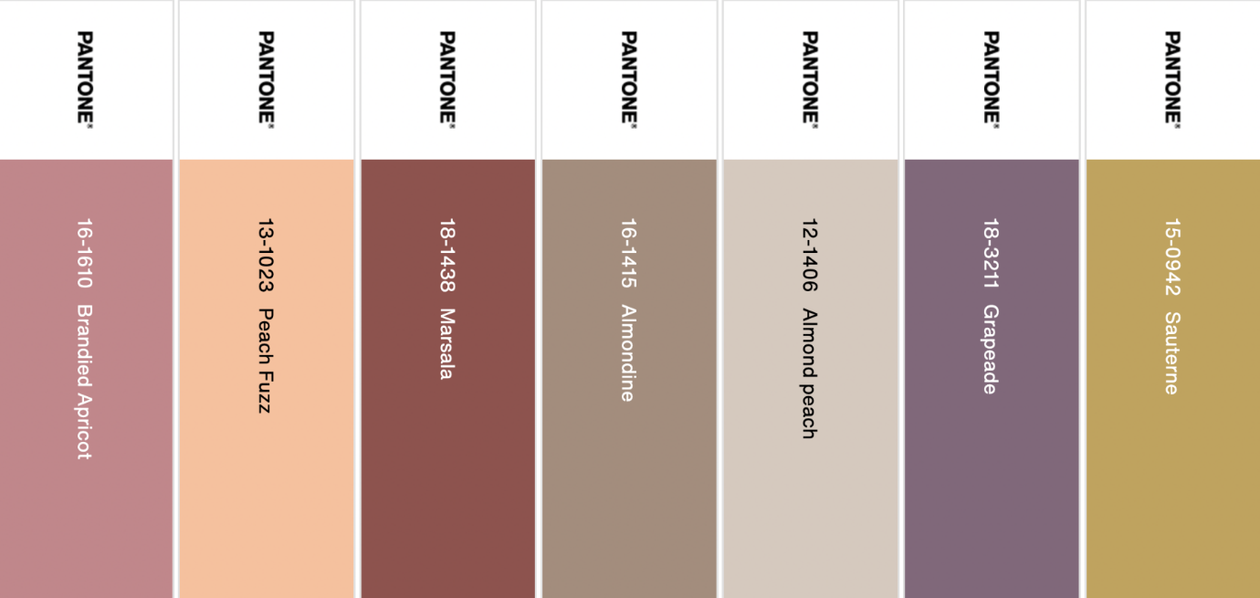
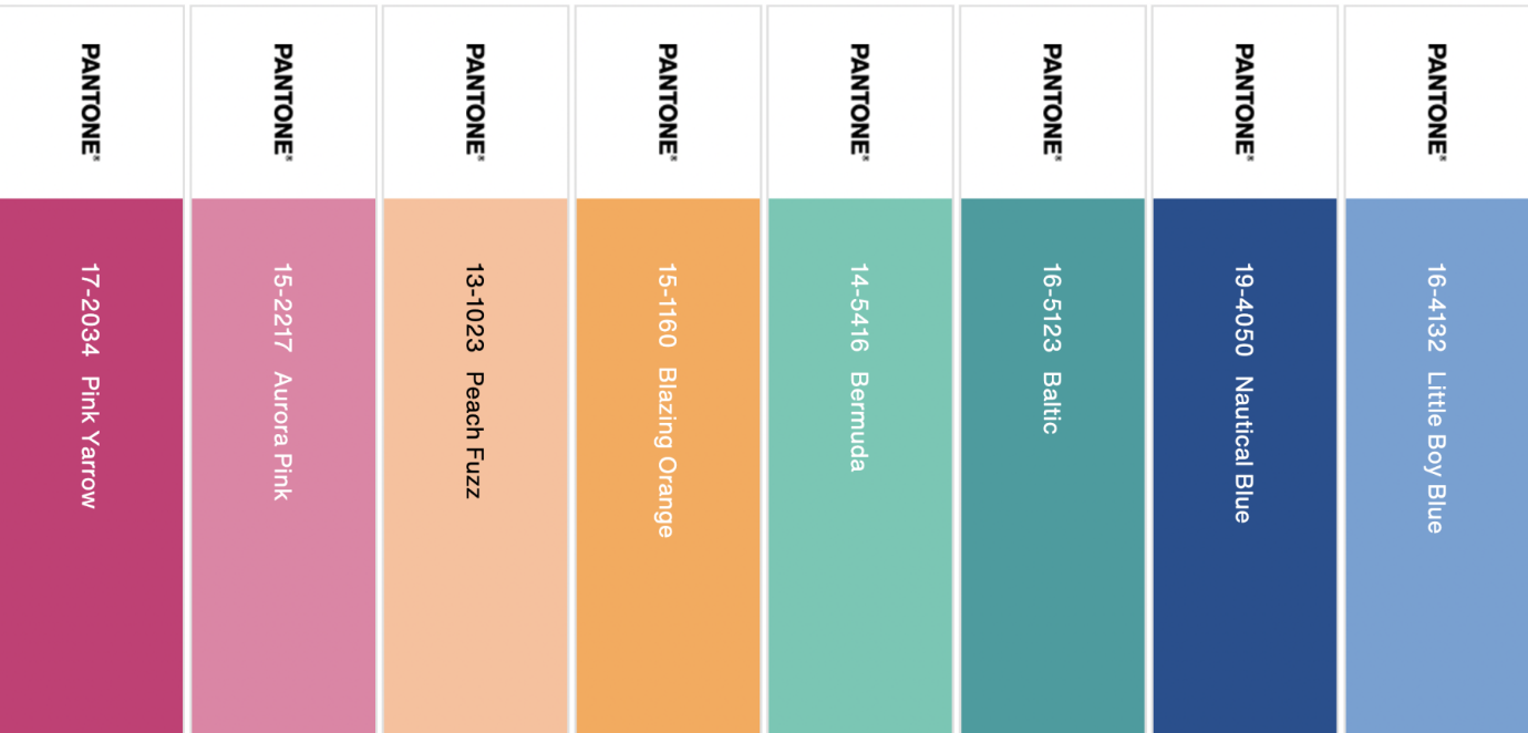
Alongside Peach Fuzz, which is Pantone’s colour of the year for 2024, Pantone also released complimentary colour palettes where you’ll see both warm, earthy tones and bold, calming colours.
With climate change at the forefront of our minds, we're embracing earthy tones. These modern natural colours reflect a collective longing to reconnect with nature and acknowledge the planet's fragility. This palette, inspired by the natural world, symbolizes an increasing shift towards sustainability and environmental awareness in design. Earthy tones offer a sense of grounding and stability, conveying a message of responsibility and respect for the environment.
Peach Fuzz is a versatile colour that can be used as both the primary and neutral colours on your website.
You don’t have to follow the trend
Some people follow trends and that is okay, but it’s also okay to not be a follower. Here are some other trends that can still work today.
Back to the future
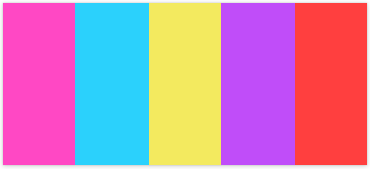
Take a colourful journey back in time! Fluorescent shades from the 80s, 90s, and early 2000s are making a comeback, bringing with them a wave of optimism and boldness. These vivid hues are both eye-catching and convey a sense of futuristic optimism. In digital and web design, these fluorescent tones are being paired with pixelated elements and abstract patterns, symbolising a trend that celebrates bold creativity and a daring approach to visual expression.
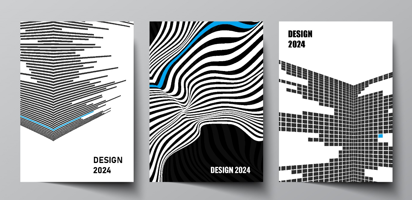
Bold minimalism - The art of less
2024 is also about striking minimalism. Expect visually clean monochromatic backgrounds which create a harmonious and uncluttered space. Paired with deliberate splashes of colour which add depth and interest to the design. Increased white or black space is key in this trend, creating a sense of balance and structure. By stripping away the non-essential and focusing on what's truly important, designs become more effective in communicating their message.
Inclusivity through colour
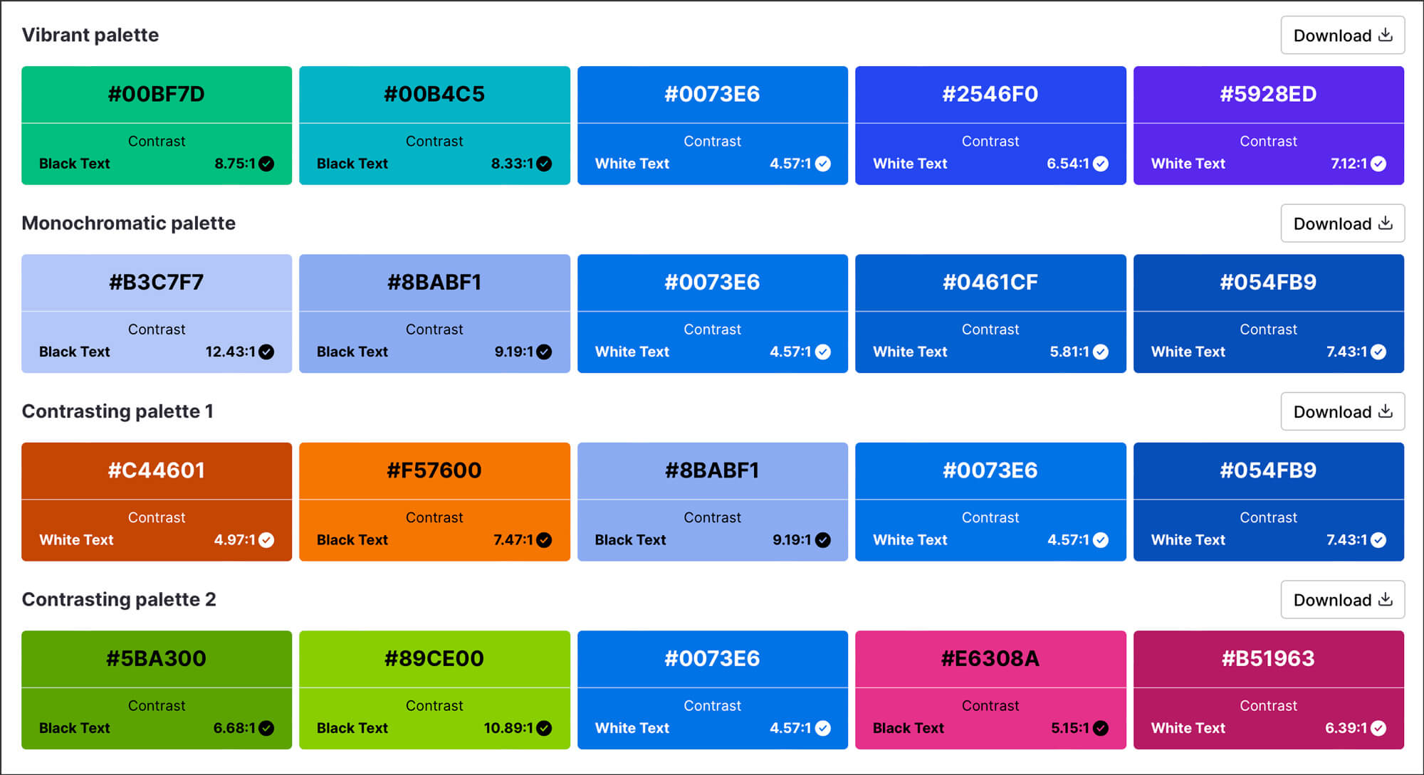
In 2024, the use of bold contrasting colours is set to emerge as a pivotal design trend, primarily driven by the growing emphasis on accessibility in digital spaces. This trend involves pairing vibrant, high-contrast colour combinations that not only catch the eye but also significantly enhance the readability and navigability of digital content for everyone, including those with visual impairments. Bold contrasts like deep blues paired with warm yellows, or well-designed monochromatic themes, are not just aesthetically pleasing but also functional, ensuring that text and important design elements stand out clearly against their backgrounds. This approach aligns with the principles of inclusive design, making digital experiences more accessible to a wider audience.
To see how you can best offer an accessible colour palette here’s an online generator which can help
https://venngage.com/tools/accessible-color-palette-generator