If you receive a 404 error page, this means that your browser was able to locate the server of which the website relates to, however, it was not able to reach the specific destination. Simply put, the site was reached but the specific page wasn’t, which then triggers the server to send a 404 error to the browser letting the visitor or client know what happened. This is often down to anything from a bad link, a deleted page or a page that has been moved elsewhere, or just a mistyped address.
As a web design agency, where do we take this?
The last thing that we want is for a visitor to one of our client’s websites getting lost. While we can set up redirects to prevent errors from moved pages, we can’t have control over user error.
As seen across the web, however, this does happen from time to time. It may not be the first thing that comes to mind when putting together a website, but they are essential. Rather than give your clients a dead end, why not ensure that they are assisted or taken care of? Putting some thought into a 404 error page can be a clever way to reinforce a brand message and even increase the likelihood of a visitor staying on the site rather than heading for the red cross, so a well-crafted 404 page can be something to use to your advantage and more importantly, be used to get the user to where they need to be.
What makes a well crafted 404 error page?
- Use of brand consistency / styling
- A reason as to why the user may have landed on the page
- Useful links to popular pages on your site. Try to guide the user accordingly.
- A search bar to allow the user to search from here for the relevant page.
- Some small light hearted humour. Be creative with your message.
- Some creative examples of 404 pages can be seen here for your inspiration: https://www.canva.com/learn/404-page-design/
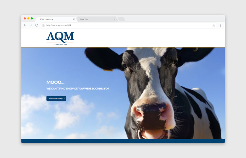
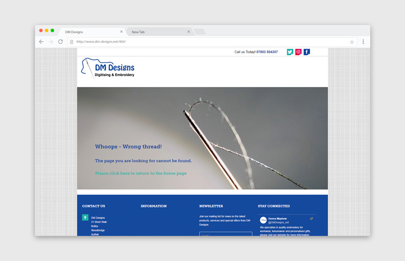
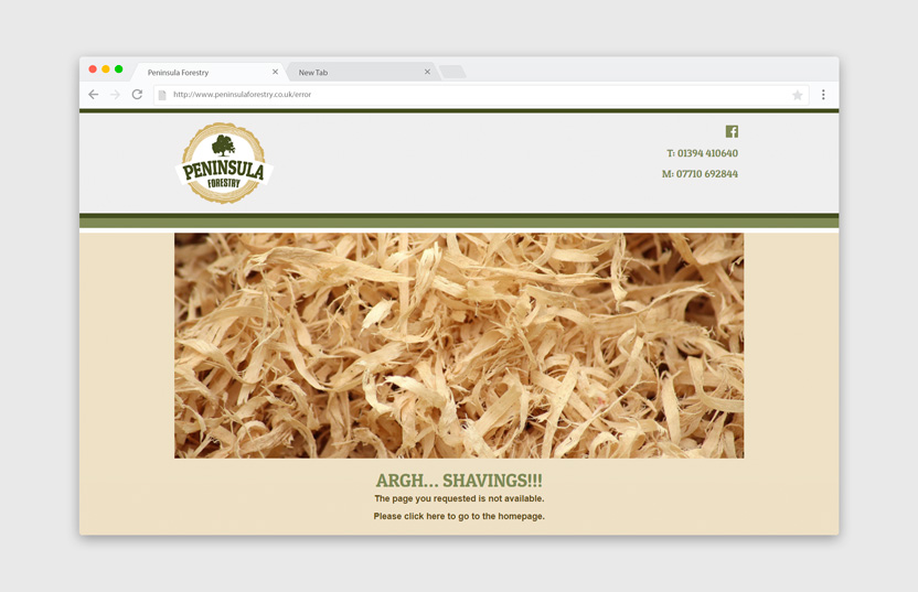
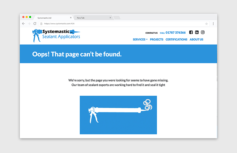
See below for some examples of what we have done for our clients 404 pages:


Need some guidance with web design or a 404 page? We would love to hear from you!